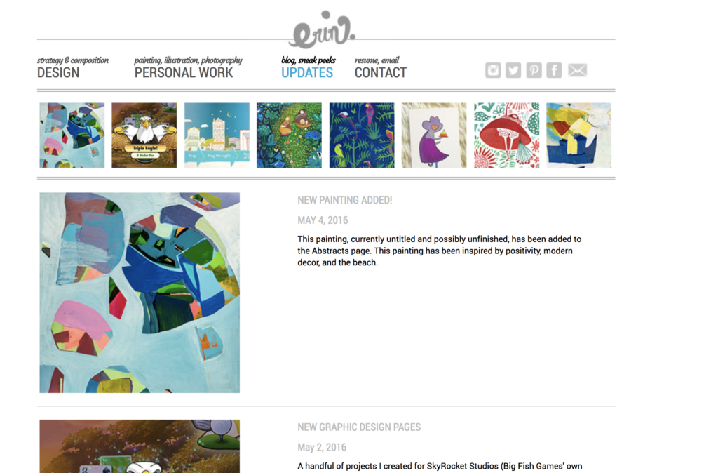
Revamped portfolio website
One of the many plights of being an artist is maintaining a website. This blog post is my first on the new website and stands as an obituary for a site I’ve poured hundreds of hours into.
Ideasbyerin.com has had many iterations over the years. Sometimes I feel like it should have had its own page in my design portfolio (how meta!) since it’s taught me so many lessons about design, web capabilities, and user experience design. It only took only a few years each for the sites I was once so proud of to become outdated and with every. single. update. I’ve wondered what took me so long.
I created my first website in 2001 on Geocities (this was early internet, around the time that livejournal and garish scrolling marquees were popular). As a kid in high school, “Erin’s Webshrine” was more of a novelty than anything. I hosted my art there, but more so I was simply excited to see my page view counter increase and read comments friends left in my guestbook. After the novelty wore off, I relied primarily on sites like flickr to share my work.
My first professional portfolio website was created 9 years later. I designed it from scratch during my last quarter of college and a programmer friend helped make it a reality. It was more of an art piece than a website, but it got me a few jobs and taught me about site hosting, web file structure, and what HTML/CSS was (and wasn’t!) capable of.
Websites everywhere improved significantly in only a few years and so it wasn’t long before I was back to the drawing board (and not the drawing board an artist wishes to be at!). This time, I challenged myself to learn code. I wireframed a simple site for myself and coded it using HTML, CSS, and a little bit of PHP – all things I previously knew nothing about, but folks on reddit helped correct some of the more complicated bits.
I updated my portfolio over the years, changed the messaging to be more engaging, added a blog… but the internet caught up with me yet again. My hand-coded site didn’t have the functionality of today’s “simple” websites, so I’m updating once again, this time with WordPress – significantly easier to update than straight code. I’ll continue pouring hours in, but I’ll never forget the lessons the past iterations of ideasbyerin.com taught me! A few highlights:
- Keep it simple.
- You’ll need to update in a few years anyway, so why not use your own personal space to try something new?
- Very few people will read the text on your portfolio website, so make sure your pictures are sellin’ it.
- If you really want someone to hear your story, cut down your text and make it obvious and engaging.
- Every time you make awesome updates, you’ll question your previous design chops. i.e. What took me so long?! Am I only just now understanding web design? (I think the answer is: no, design is an iterative process.)
Anyway, if you’re reading my blog, thank you! I wrote this post just for me (to reflect on my hours spent designing & coding), but I am excited to begin writing for an audience.


